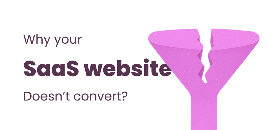
Most early-stage founders believe that a shiny website is enough to sell their upcoming product. But here’s the truth: a pretty website without conversions is just decoration.
And one of the main reasons SaaS startups fail is exactly this: their website doesn’t turn visitors into customers.
Even worse: in today’s AI-driven world, you don’t get a second chance. If a user leaves, they’re gone for good. Google research shows that 88% of people never return to a website after a poor user experience.
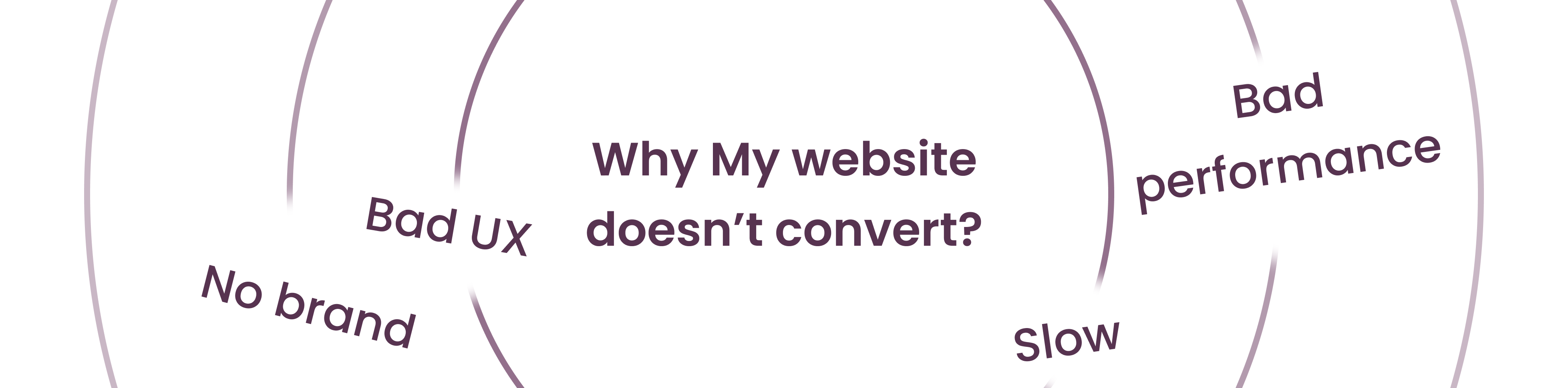
So let’s dive into the 7 main reasons why your SaaS website isn’t converting and how you can fix it.
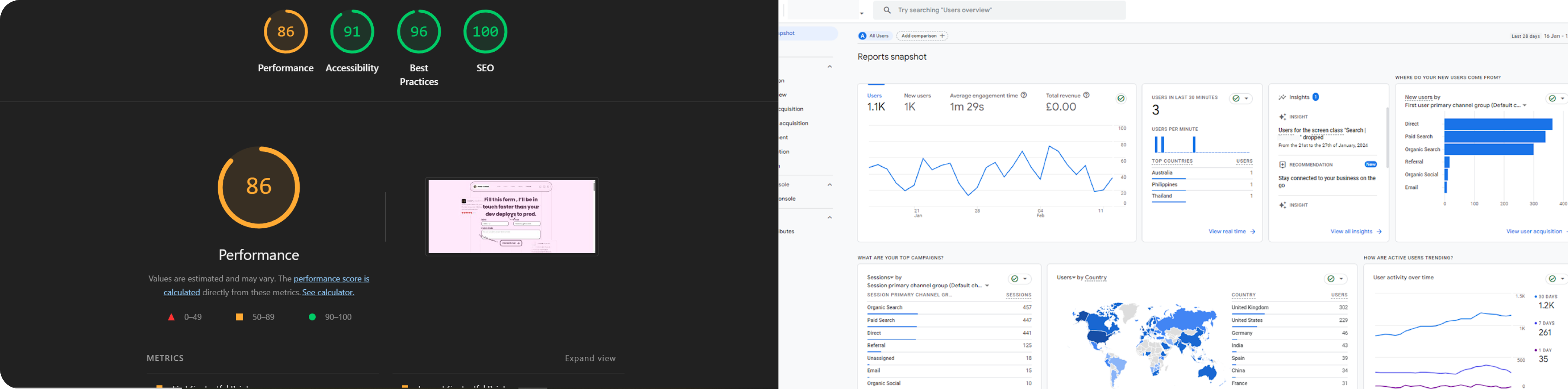
If these numbers don’t look good, your website needs work. Let’s see why.
In today’s crowded world, people are chasing dopamine. Endless videos, endless meetings, endless problems. If your website doesn’t feel good, they’ll leave in seconds.
As Wolf of Wall Street taught us:
People don’t buy with logic. They buy with feelings.
Here’s a UX checklist for SaaS websites:
ASYNC / DEFEROne lesson I love from Better Call Saul is how Saul always knew exactly who he was dealing with — whether elderly clients or criminals. He spoke their language, understood their behavior, and influenced them.
Your customers do the same mental check before buying:
At least two of these must be “yes” before they buy.
Close your eyes and imagine Apple as a person: techy, innovative, minimalistic, early 30s, reliable. You saw him, right?
That’s brand personality. Your brand should feel human, consistent, and trustworthy across every touchpoint — website, product, support, social media.
Brand is not just your product. It’s the vibe people feel.
At the bottom of the funnel, one last step matters: trust.
A button alone doesn’t convert. Your users need to know:
And here’s a painful truth:
No video = high bounce rate (especially for first-time customers).
Users won’t spend 5 minutes testing your product. Instead, show them animated demos + use cases to hook them fast.
Here’s a real example from my own website:
The result? 45% increase in booked meetings.
Lesson: don’t overcomplicate. Keep flows simple, fast, and purposeful.
Your users aren’t your fans — they’re buyers. They want speed.
So ditch multi-step forms. Stick to 1–5 simple inputs and a clear Submit button.
Every designer struggles with conversion at some point. I failed multiple times until I cracked the code of what works.
Take SorenHQ (currently fundraising). In pre-launch, I designed animated demos, a strong brand, an authentic About Us, and a fully responsive site. The result? Their pitch resonated. Same as lots of other projects like Nursebloc or The Dome.
👉 If you’re an early-stage SaaS founder with no product yet but looking for your first customers or investors, I can help from branding and website development to product design.
Book a call through my contact form or directly via Calendly.
And remember: your website isn’t just a page. It’s your first sales pitch. Make it count.